Image: LIGO/Caltech/MIT/Sonoma State (Aurore Simonnet)

Tom Callister

Gallery

I spend a lot of time making plots and graphics for talks, and sometimes I’m asked to share these for others to use. Below are some recent figures, with links to the code used to make them. Please use them in your own talks! If you do, please credit me (and feel free to star the GitHub repos).

Suggested credit: Figure: T. Callister (github.com/gw-gallery)

Landscape of observed compact binary mergers
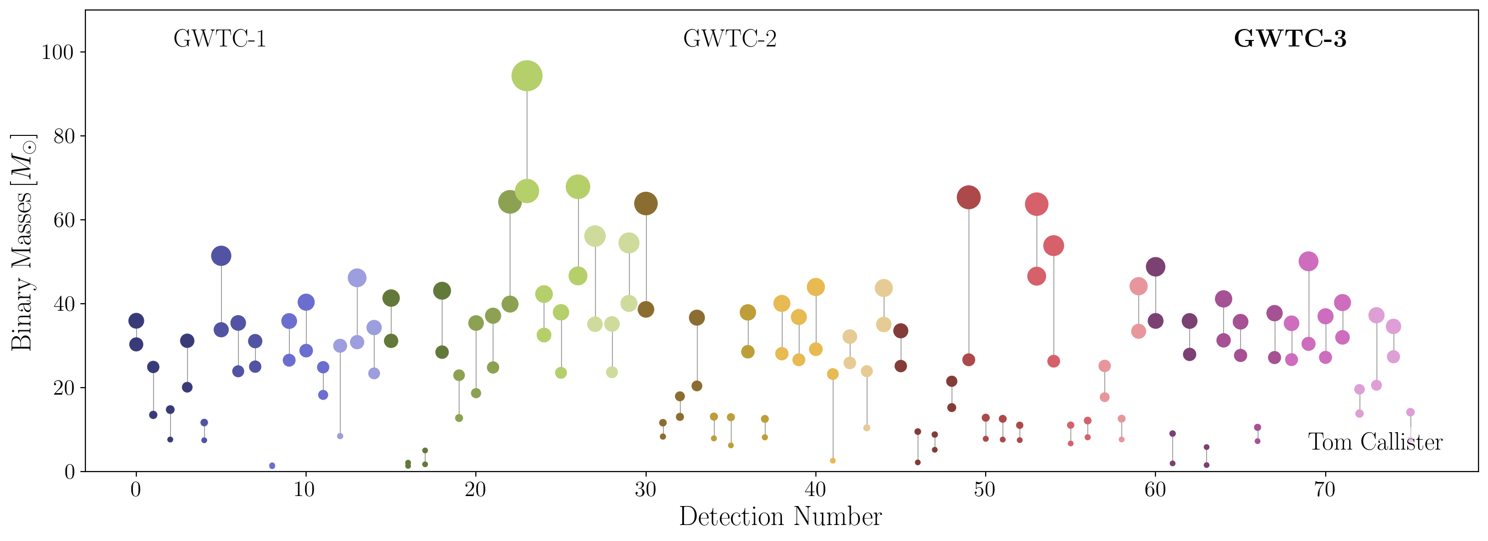
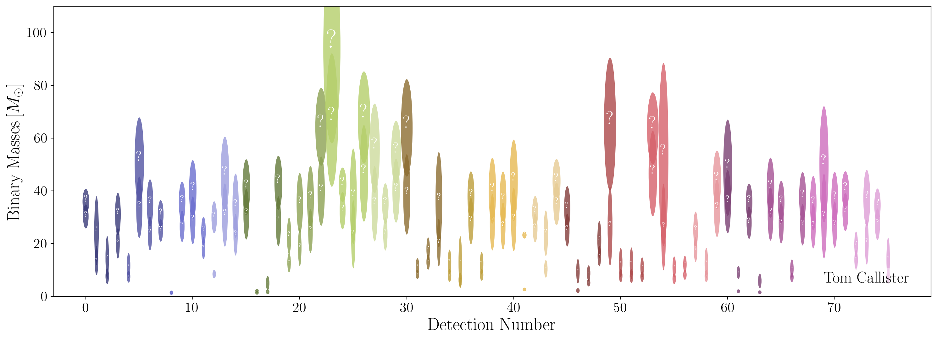
The masses of all confident compact binary detections published by the LIGO-Virgo-KAGRA Collaboration through GWTC-3. The first plot shows point estimates (“best guesses”) of each object’s mass, while the second shows the actual uncertainties associated with each measurement.
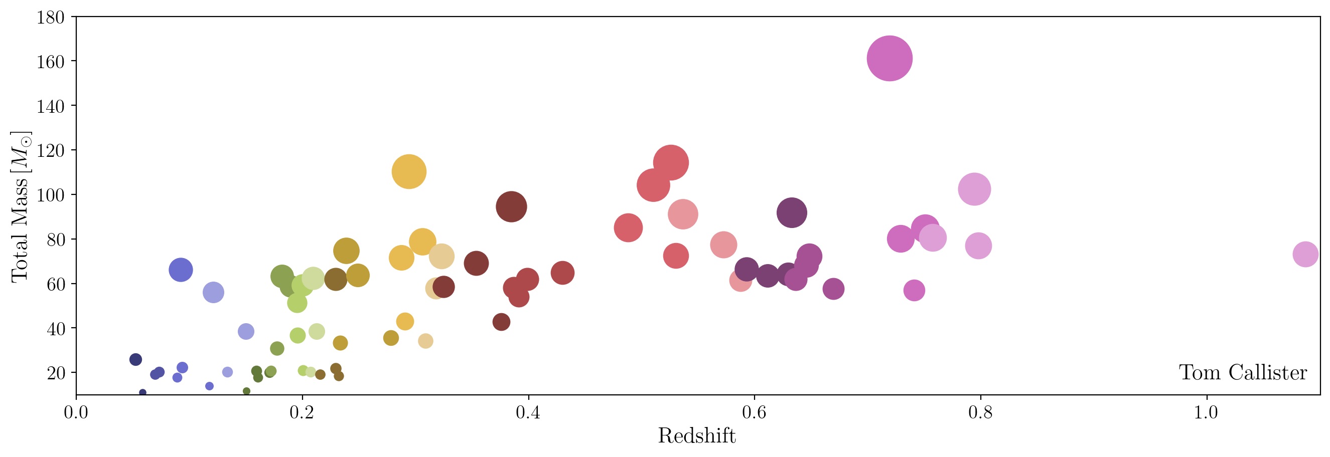
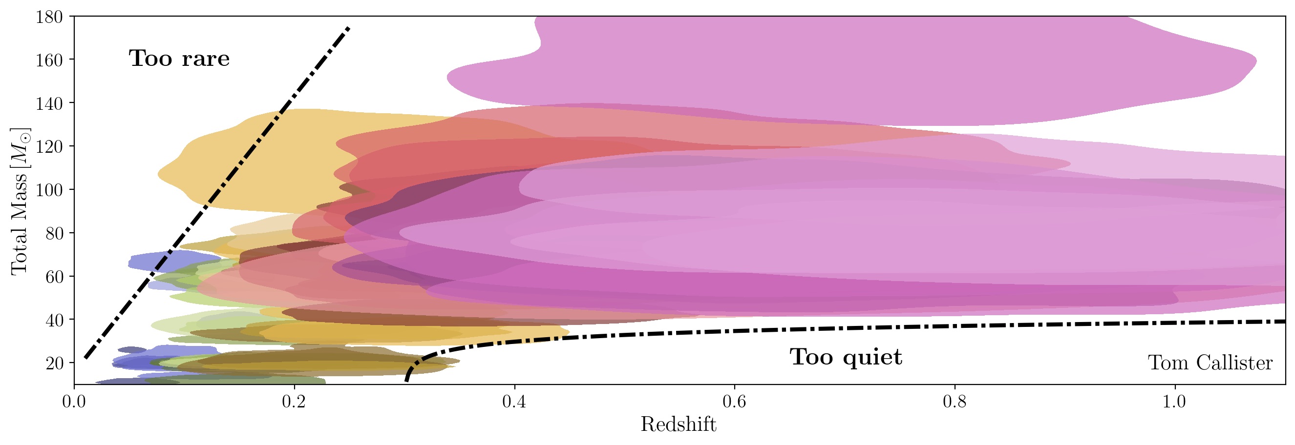
Observed binary black hole masses vs. redshifts

The total masses and redshifts of all binary black hole detections published by the LIGO-Virgo-KAGRA Collaboration through GWTC-3. I like using this pair of plots to illustrate why analysis of the compact binary population is hard. If you look only at point estimates of binary properties (first plot), it seems as if there is a clear evolution of black hole masses with redshift. Conclusions are much murkier if you instead look at full posteriors on binary masses and redshifts (second plot); this is further compounded by search selection effects (which prevent observations in the bottom right corner) and finite observing time (consistent with no observations in the top left corner).

Hierarchical inference demonstration

A quick demonstration of hierarchical inference, showing recovery of the correct underlying population (left) as we gather more and more noisy measurements drawn from this population (right).